Debrief
Project | UX Fundamentals
Prompt | Doctors Under the Radar hopes to provide Doctors with a safe community platform where doctors can meet, find resources, support, create groups to better manage their mental health.
Team | Group Project
Role | Product Manager/Planning Lead
Platforms | Hand sketches, Figma
Timeline | 3 weeks
Scope | Mid-High Fidelity Prototype

Working Collaboratively
Until this point, all of my projects have been independent, where I am in charge of the entire UX\UI process. Now It is time take my learnings and put them towards a collaborative group setting.
Product Management
In this project, I took on the role of Product Lead or Product Manager. My main objective is to guide/manage my team through the UX\UI process offer support where it’s needed and participate in the design process.
The Prompt: Doctors Under the Radar
Doctors Under the Radar hopes to provide Doctors with a safe community platform where doctors can meet, find resources, support, create groups to better manage their mental health.
Before we start our research, I need to create a project plan and a statement of work.
The Project Plan is a document with specific dates, deliverables and ownership. This document will be a living, breathing document that is constantly referred to and updated throughout the process.
The SOW (Statement of Work) is a team contract outlining, guidelines, policies, consequences of policies are broken and contact information. This is an extremely important document and will be the foundation of how the team operates.
Creating a SOW
1.) Outlining our team policies along with consequences if policies are broken
2.) Team and individual goals
3.) Communication guidelines to respect everyones time and space
The true purpose of the Statement of Work is to communicate clear expectations for all stakeholders involved in the process. Every team member has a clear defined role, clear expectations on when deliverables are due, and what to expect if things fall through the cracks. This document keeps each team member accountable. My job as a product manager isn’t to hold anyones hand as they work on their portion of the puzzle, my job is to make sure everyone has the resources they need, answer any questions about the process, deliverables or business.
Creating a Project Plan
1.) Project Timeline- When are deliverables due
2.) Understanding what Deliverables are needed for this project.
3.) Evening Distributing deliverables amongst the team so everyone contributes
A project plan is a little more complex than a Statement of Work. As the project planning lead, I need to understand the task, the business, the market and the team. Though I may not have every single answer but it is my job to find those answers and guide the team to meet our goals.
My first step in creating a project plan is to understand the final deliverables and due date. From this point I work my way backwards.

Due Date: 3 weeks after assignment
Final Deliverable: Presentation deck, Mid to High Fidelity Prototype, Figma Component Library
Research Phase:
Competitive & Comparative Analysis
Market/Secondary Research
Survey & Survey Creation
User Interviews & Interview Questions
Usability Testing
User Flow
Affinity Mapping - “I” Statements
HMW
Problem Statement
Persona
Journey Map
Ideation Phase:
Conduct Usability Testing on prototype
Low Fidelity Prototype
Create Wire Frames
Figma Component Library
Site Map
Open/Closed Card Sorting
Content/Feature Library/Prioritization
sketches/design studio
Branding/Site Map
I’ve pulled all the tasks that need to be completed, now it’s time to create a document and assign team members and deliverable dates. For me, communication is key, the more information I can provide, the less confusion there will be when it comes to finalizing deliverables.

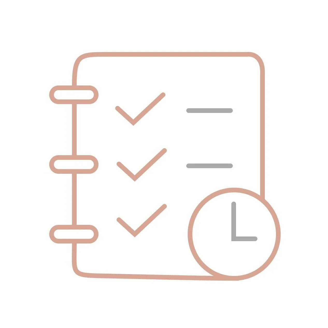
Task Status
A Task Status Key
Task Name
Date when Task is started
Date when Task Needs to be completed
Task specific notes
Owner of the Document or file
Where to locate the document
A Task Status Key
Overall Objective & Weekly Objective
In a real world, assigning tasks would be easier since there are defined roles. As students learning all aspects of the UX\UI process, we need to participate in each task and deliverable. I assigned ownership of the documents by our role. Our Research Lead was in charge of all the research deliverable documents. We would all take part in conducting interviews, usability testings, C&C analysis, and secondary research. It was our research leads role to collect all our information and compile them into a single document. This would also apply to the Design Lead. We would all take part in researching features and design studio, but the design lead would take all that information and compile them into wire frames and eventually a final prototype.
This was a collaborative and every moving process. As we complete deliverables and move onto the next step, items are being added, removed or updated on the project plan.
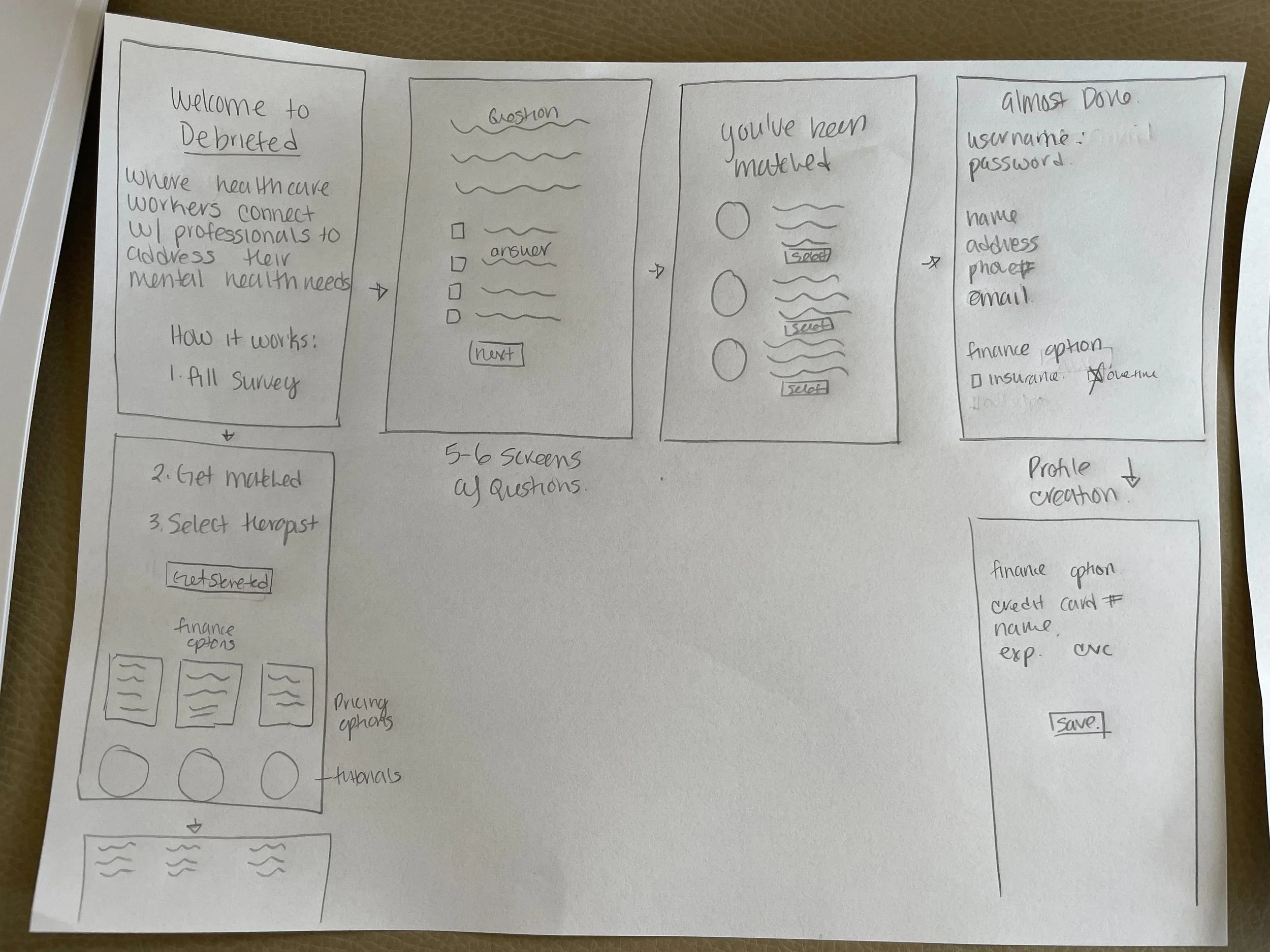
Step 1/2 : Identifying the problem

Week Objective : Research

Representation of a C&C Analysis
The first week of our project was dedicated to research, and since we had a three person team, we divided and conquered. We conducted Comparative/Competitive Analysis, Feature Comparison, User Interviews, Usability Testing, Business Analysis, Market research and Secondary
We compiled our information into a single google drive, where we could look at each others findings. The research lead was tasked to compile and organize the findings so we can review uniformed data.
Once our information was collected we did a collaborative Affinity Mapping session where we had a brainstorming session creating our “I” statements, HMW statements and the problem statement.
Persona
Based on findings, our persona was a 45 year old female nurse, married with children.
Behaviors
Puts family, patients and work first.
Works Long Hours
Uses her phone to decompress at night before bed.
Doesn’t get the time to exercise or sleep well due to long hours at work
Devotes free time to family where she can
Tries to eat healthy but can’t stick to it when hours and schedules are difficult to balance
Needs & Wants
I want a space where I can talk about my issues at work
I don’t want to burden my family and friends with my work issues
I want to be able to talk about my issues with out worrying I will lose my job.
Representation of a Person
“If I could unburden myself from the traumas of my day to day work, I would be able to serve my family and patients better.”

Representation of an Affinity Map
The results:
I am often stressed at my job with no outlet.
I feel like work doesn’t provide adequate resources for me.
I think therapy is a beneficial practice.
I don’t check in with myself about how I am doing mentally.
I have complications when finding a therapist.
I often don’t have time for myself.
“Sometimes I don’t feel safe at work with my workload, which causes a lot of stress. I also feel guilt because I’m not providing the best care for my patient being so short staffed. But what can I do? I can’t do it all..it’s too much”
Problem Statement:
Healthcare workers recognize they have mental health issues due to extraneous working conditions, deterioration of patients health, and lack of mental health resources made available to employees.
How Might We:
How might we make healthcare workers feel comfortable seeking treatment?
How might we help healthcare workers check in on their mental health more often?
How might we help healthcare workers find resources in a central location?
How might we give healthcare workers a platform to express their mental health needs?

Step 2/3: Ideate & Prototype
Let’s start designing.
User Flow
After we concluded our research we wanted our users to focus on:
Completing a Mental Health Survey
Creating a profile page
Selecting a Therapist
Scheduling a 1:1 Session with a Therapist
Site Map
With mental health and anxiety being forefront of mind, we wanted out global navigation to be clean and concise. we would focus on":
Home Page- with the start of the mental health survey
Message Page - where users can directly message therapists
Social Page- a Community page where users can connect with others
Settings- Basic setting page where users can update their information
Profile Page- Basic profile page with therapist notes, upcoming sessions

Representation of a User Flow

Representation of a Site Map
The Foundation is set, time to connect the dots
With three designers in the mix, we conducted a design studio. Design studio is a great way to collaborate and share your ideas with the team. We all took 30 minutes, pulled together our interpretations of the data and then walked through each frame.

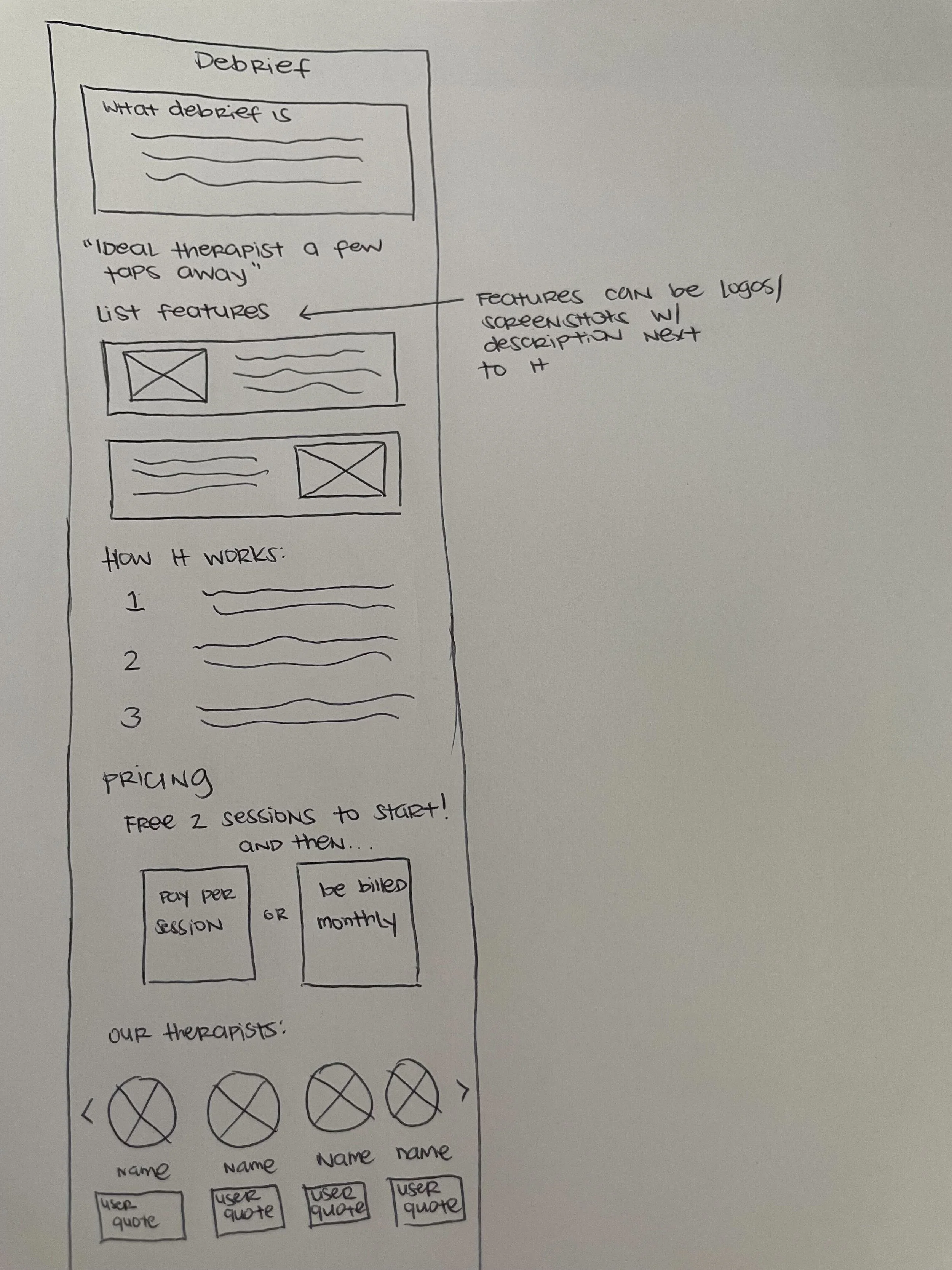
After we went through a series of sketches, our Design Lead pulled features, lay outs and content from all of our ideas to create a final product.
We had a clear set of focuses for each wire frame.
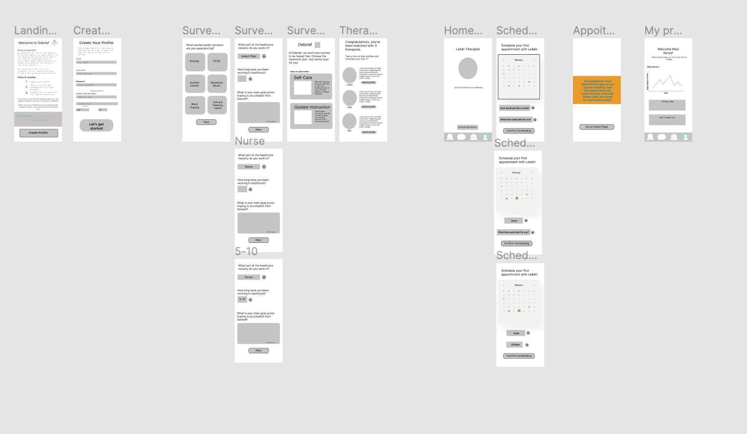
Home page- We wanted clear and concise copy stating the purpose of Debrief and a Call to action button leading the user to the mental health survey.
Survey- Our goal or the survey was to make sure it was not overly cluttered, the call to action buttons were leading and clear.
Therapist Selection- Once the user completed the survey we wanted to give users options for their therapist match. We noticed in many competitors that users matched with a single therapist. Though the algorithm for the match may be correct, when people meet the dynamic could be different. This was a big feature we wanted on the app.
Therapist Profile Page- Before the User selected a therapist we wanted to share a therapist profile, where users can read their credentials and any reviews. Helping users get to know their therapist before committing.
Scheduling Feature- We decided to use a clickable calendar with dropdown options for time and meeting type. The goal here was to have an easy and clean call to action buttons leading the user.
Confirmation page- The confirmation pop up is a basic concept. We wanted to confirm the details with the user. If there something was incorrect they could go back and change their options.
User Profile Page- We started off with the user profile page being a simple information portal. With their therapist information, scheduling updates, and messaging feature.
The wireframes created it was time to refine and add branding.
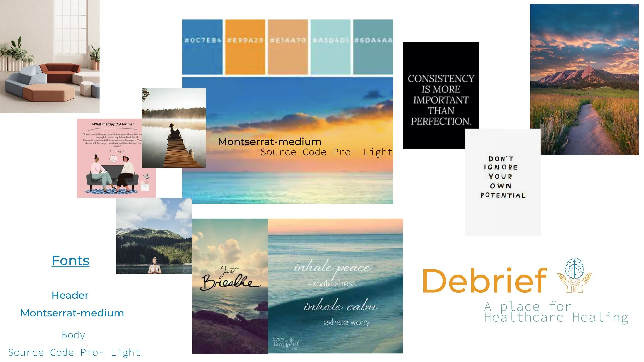
Our branding consisted of a mix of warm and cool colors, emulating a sunset over the ocean. We wanted to focus on the cool colors since they provide a sense of calm but also give a pop of the orange for warmth.
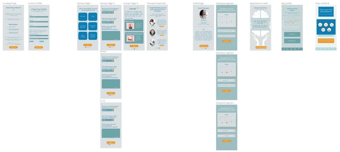
Final Wire Frames
Step 5: Test

Test, Test , Test
Time to get our testing on. For this project we have to test the usability of the prototype as well as the branding and accessibility. Having a poor accessibility on a platform is extremely exclusive and alienates major groups of users.
Accessibility
Accessibility is a major topic in the industry. Often we do not realize we are alienating groups of users, but it is our job as UX\UI Designers to be as inclusive as possible. Inclusivity in UX\UI is as simple as making text bigger for visually impaired users to read, or updating colors that are easier to see for those that are color blind. If users are on a mobile or a website they are using some sort of technology, we need to be as inclusive to as many groups as possible.
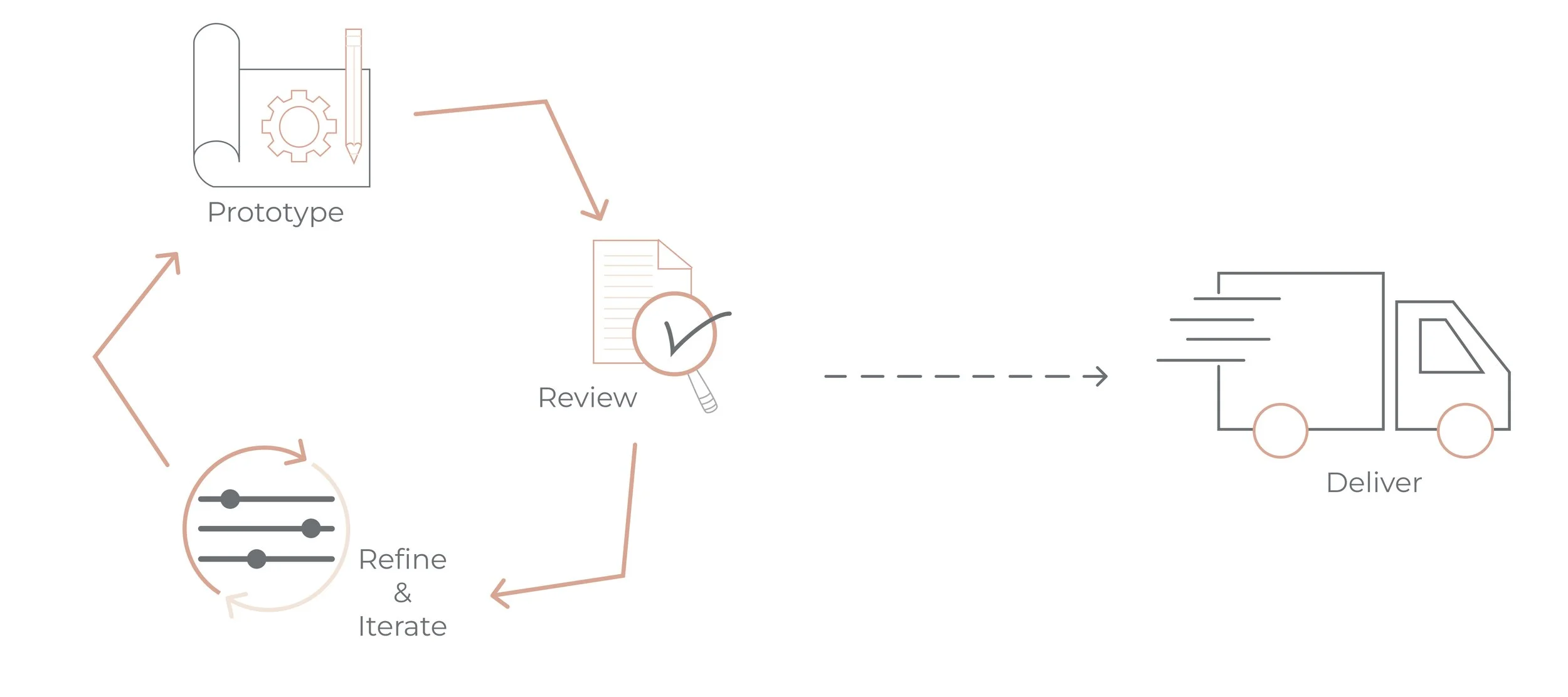
What is next:
The next portion of this process has multiple phases.
1.) Continue to test and update the UI.
2.) Add more features to create a full experience
3.) Continue to test and update accessibility with branding and colors and continue to refine copy.
4.) Track the changes that have been made across the board and see how they are affecting the business and business timelines.