Eco-Stylist
Project | UI Fundamentals
Prompt | Eco-Stylist is an online clothing retailer that focuses on personal styling and connecting the eco-conscious consumer with sustainable fashion and clothing brands.
Team | Independent Project
Role | Researcher, Designer, Product Manager
Platforms | Hand sketches, Figma
Timeline | 2 weeks
Scope | Mid-Level fidelity Prototype
Understanding UI Fundamentals
The next step in my UX\UI Journey is working with an existing product and updating the UI- User Interface.
The Platform: Eco-Stylist
Eco-Stylist started off as platform dedicated to expanding the conversation on sustainability and sustainable brands to the male market. But has expanded into a much larger conversation and e-commerce platform.
Step 1/2 : Identifying the problem
Heuristic & Comparative/Competitive Analysis
The beginning of my research started with an independent analysis of the platform. Giving me a baseline to understand the possible issues before reaching out to users for interviews and testing.
Heuristic and C&C Analysis.
A Heuristic analysis the ability for a person to learn or discover something for themselves, using the Usability Principle LEMERS. I was able to make my own assumptions of any issues on the website.
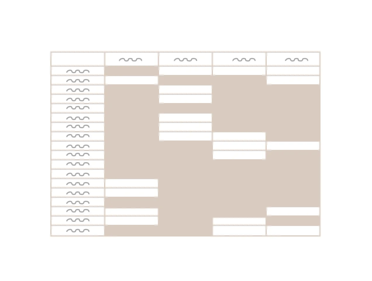
I followed the Heuristic evaluation with a C&C analysis (Competitive & Comparative Analysis) where I would compare different features and design elements against direct and non-direct competitors, giving me insights on where Eco-Stylist is excelling and lacking.
Persona/Journey Map:
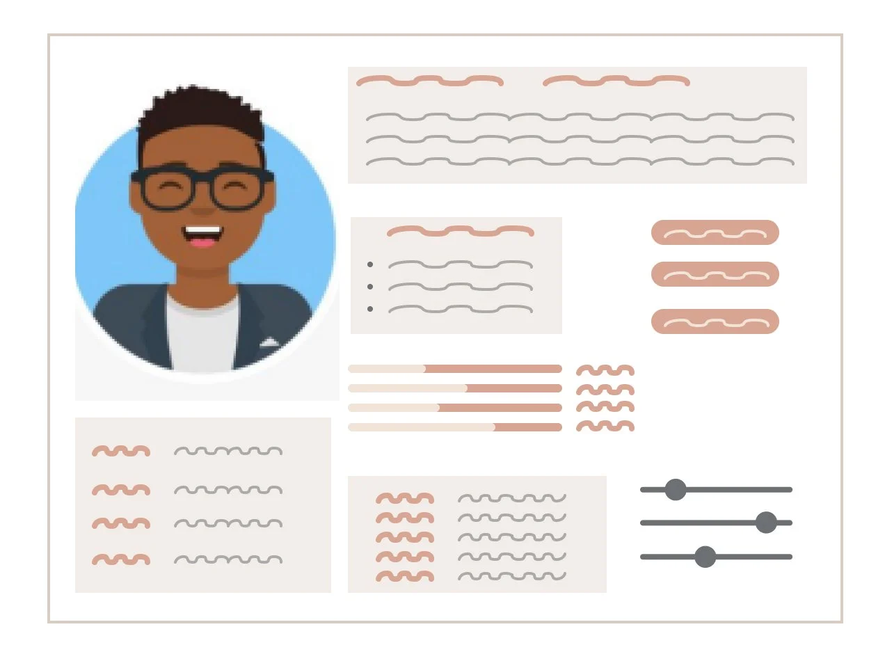
Every product is built for a specific user, solving a specific problem. As we start to interview more users, and survey larger groups of people, we need to zero in on who the user is and make sure our updates are appropriate for that person. It is time to create a persona, the personality of the user where we understand their frustrations and goals and how that can be fixed or achieved with the product. We also create a journey map, this is a documentation of their experience while using the product. When we design solutions we keep this persona in mind and ask our selves basic questions to keep our creativity on track.
Representation of a Persona
Representation of a Journey Map
The results:
Heuristic Evaluation | C&C Analysis:
No Traditional E-commerce platform or checkout process
No Check out process or Profile set up for returning users.
The Branding is not inline with their mission statement of “Give a Damn” and their vision of bringing the sustainable conversation to mainstream media.
Minimal to no marketing messages or trending products
User Interviews | Usability Testing
There is no shopping cart on Eco-styist.com to add items to
The Filters and Categories did not meet expectations when trying to search for products.
There is no profile to add personal preferences.
There is too much information on the website forcing users to click around a lot and read long articles and text.
Representation of an C&C Analysis
Problem Statement:
Users need a way to search and purchase sustainable products and brands without being directed away from Eco-Stylists website.
How Might We:
How might we offer a way for user’s to easily search for sustainable brands?
How might we create an easy e-commerce platform on Eco-Stylists?
How might we update the branding and aesthetics of the Eco-Stylists to feel like an e-commerce platform?
Step 2/3: Ideate & Prototype
Let’s start designing.
We’ve finished our research phase and moving onto ideating/designing. Before we can start designing we need to get organized.
1: Create a User flow- to keep the ideation concentrated on a single user flow.
2: Create a site map- The architecture/blueprint of the redesign.
The User Flow consisted of:
User Flow
Search for multiple products
Add products to a shopping cart
Checkout process
Site Map
Update the categories in the global navigation
Update the sub-navigation accordingly to the global navigation
Representation of a User Flow
Representation of a Site Map
When creating a site map we need to deconstruct the navigation and understand how the pages are set up. Once we understand the basics of how the website is built, we test the categorization with users. We test this by creating a card sort.
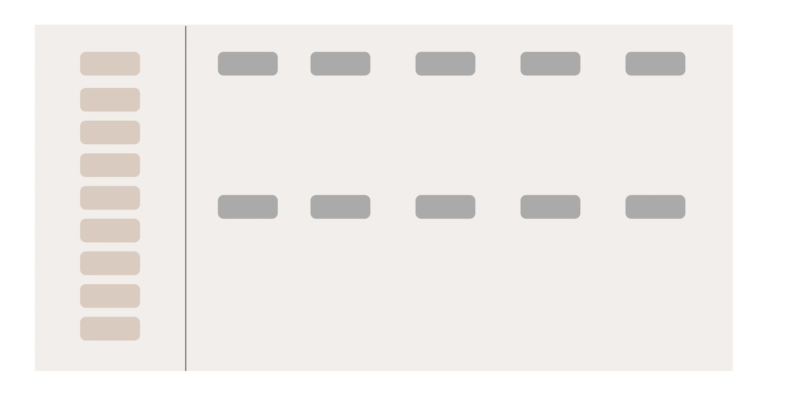
Closed Card Sort
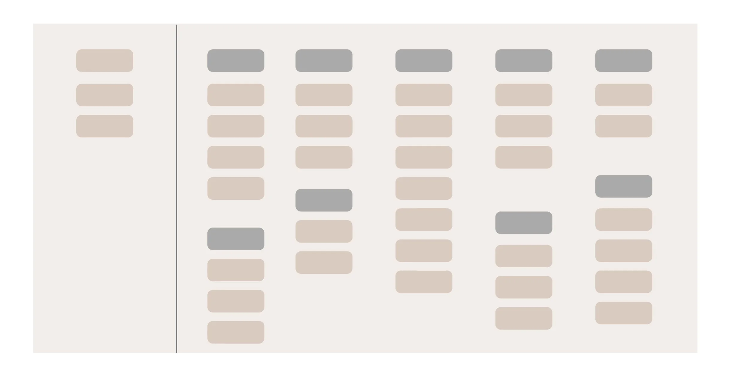
Open Card Sort
Categories are created ahead of time and users are given a list of content. They will move the content list into the present categories. A closed card sort can be conducted before or after an open card sort but I found it best to conduct it after the open card sort. This will validate any assumptions with the open card sort.
Users are given a list of items and they sort them into categories of their choosing. This is a great place to start when trying to organize content. You get an inside view of how a user would search for specific content and can decide where certain content should live.
Representation of an Open Card Sort
Representation of a Closed Card Sort
The Foundation is set, time to connect the dots
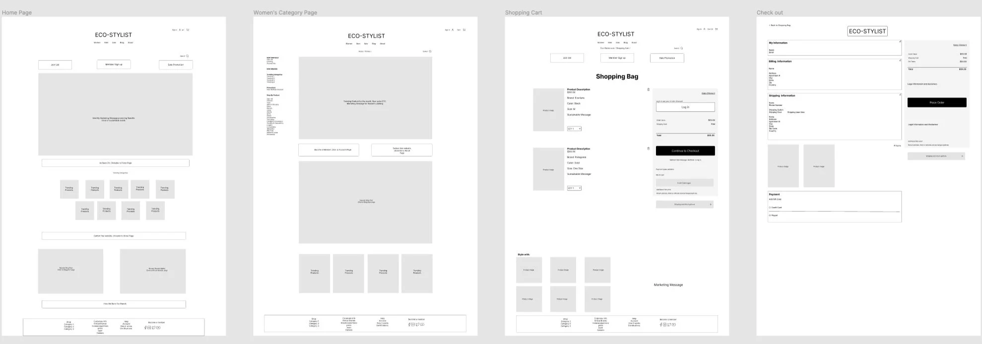
The first step in my ideation process was to create the global navigation pages.
Home Page - The content of the home page would consist of call to action buttons for different pages, monthly marketing message, trending products section, latest blogs, and recent brands section. The home page should house the content of the entire product, in a creative way without feeling overwhelming or cluttered.
Category page- The Category page would consist of links to sub categories, Marketing Messages and a trending products section. We also need to keep in mind how users will filter, sort and search for products.
Shopping Cart - The shopping cart should consist product info before checkout, a trending products section or “add to your cart” section. The shopping cart must have clear call to action buttons making it easy and stress free to start the check out process.
Check Out Page - The check out page should consist of personal information input sections and product information. It is imperative for the checkout page to have clear concise information, clear call to action buttons and the user must feel secure while adding their personal information.
With our baseline complete, time to fill in the spaces.
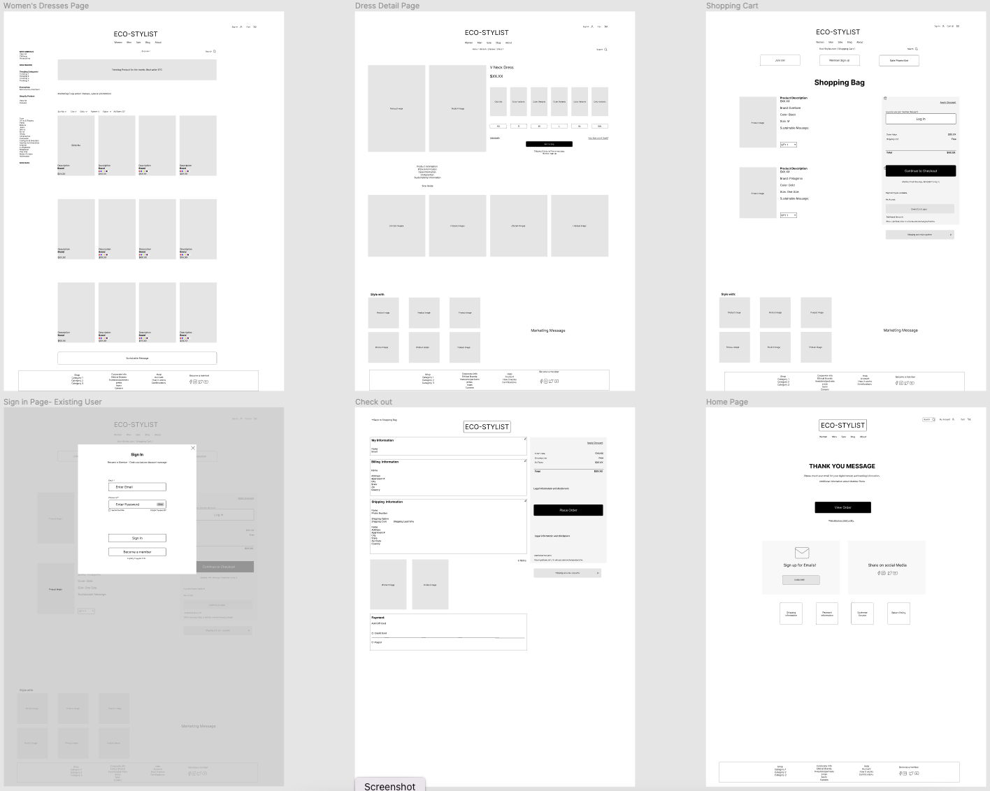
With the four main pages created, it is time to create the subset of pages that would complete an e-commerce process. While creating the blocks of each page it is important to keep in mind how the user will use each page, and not just the aesthetic layout of each page. We need to add affordances such as back buttons, sliders and tabs that are recognizable for users to interact with the website.
From the Category page, we need to create > Category Page > SubcategoryPage > Product Page
From the Shopping Cart Page, we need to create > A user Login/profile page or popup
From the Check out Page, we need to create > Profile Page> Purchase Confirmation Page/Popup
Time to Create the prototype.
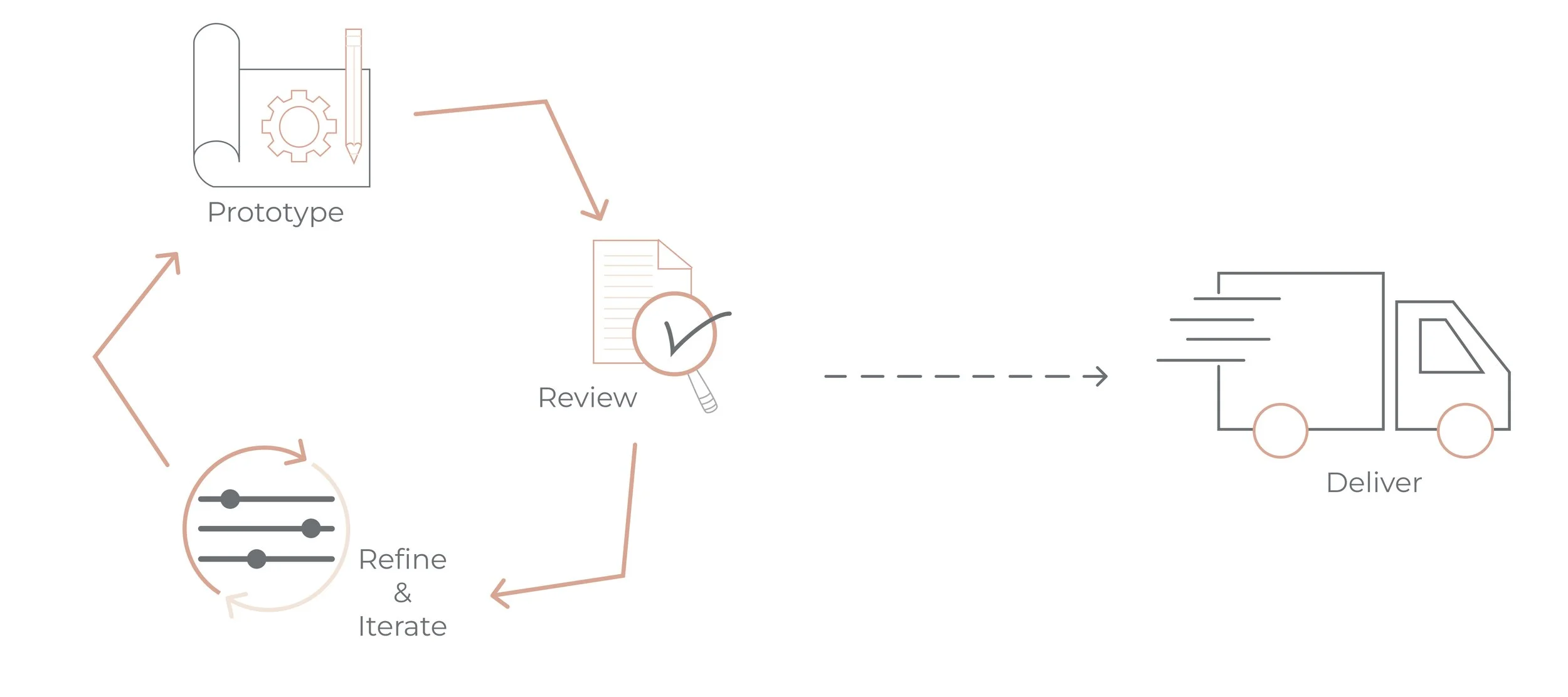
With the user flow in mind, the main pages and subset of pages have been created. It is time to create a functioning prototype. The first prototype will be in a low fidelity mode, our goal is to make sure there are no gaps in the product search, selection and check out process. We start to introduce branding, images, copy and color towards the end of the process, when the product is ready to be released to the public.
Step 5: Test
Test, Test , Test
It’s time to do some usability testing on the first iteration of the prototype. Our objective is to make sure we are addressing all the pain points of the user flow, and make adjustments to complete the process.
The Results:
Users need more copy or direction when trying to navigate through the e-commerce process > I added “CLICK ME” text on certain blocks showing the user where they needed to go next.
User’s wanted more options when signing into the check out process > I added 3 different options, an existing user, a new user or a guest user.
What is next:
The next portion of this process has multiple phases.
1.) Continue to test and update the UI.
2.) Add more user flows to different aspects of the website then test and update accordingly
3.) Start to implement updated branding such as Color, Images and Text, then test and update accordingly.
4.) Track the changes that have been made across the board and see how they are affecting the business and business timelines.


