Texas Wine Lover
Project | Client Project
Prompt | Jeff and Gloria Schlanser first started visiting many Texas wineries in January 2010 and felt their experiences could benefit both consumers and producers. The blog began by describing their experiences at each winery, but quickly moved into providing news about the Texas wine industry too. Along the way, news about non-Texas wine, product reviews, and more were added, because after all, one does not only drink Texas wine. The goal also at Texas Wine Lover is to provide the latest up-to-date listings of wineries including a winery map with their locations to help you plan your visits.
Team | Group Project
Role | Product Manager, Designer, Researcher
Platforms | Figma
Timeline | 3 weeks
Scope | High Fidelity Wire Frame, Site Map, Developer Hand off Documents
Working with Clients
We have reached the culmination of our course and it is time for our Capstone Project. Working with a Client.
The Platform: Texas Wine Lover
Jeff and Gloria Schlanser first started visiting many Texas wineries in January 2010 and felt their experiences could benefit both consumers and producers. The blog began by describing their experiences at each winery, but quickly moved into providing news about the Texas wine industry too. Along the way, news about non-Texas wine, product reviews, and more were added, because after all, one does not only drink Texas wine.
Getting Started
The training wheels are officially off and it’s time to work with real clients. Since every project is unique we need to set a foundation and set ourselves up for success.
Create a SOW/Project Plan
After our meeting we came together as team to create our SOW/Project plan. We needed to discuss what types of deliverables the client would need, what type of research we wanted to conduct and our team roles and goals. Once we were in agreement on the type of deliverables we wanted, I got to work with setting dates and owners, though we would take part in every aspect of the process.
Meet the client
Before we started to create documents and research plans, we had to meet the client. This was very much a user interview. The client walked us through their needs and we discussed his business model, what his future plans, what he wanted from our research and shared metrics and documents for us to review. This conversation was extremely fruitful and gave us a baseline and direction.
Client Check in
Communication is key within a team, it is even more crucial when working with a client. Client check in’s show the client where we are in the process, what we have learned and what our next steps are. This also gives the client an opportunity to weigh in and offer more suggestions and ideas of what they are looking for. The team also have additional opportunities to ask more questions after the user interviews are complete, clearing up any confusion.
Research
Just like every project I’ve worked on, we would conduct the full research process. Heuristic Analysis, C&C Analysis, User Interviews and Usability testing. We know what the client wants, but what do his users want. From that information we’re able to create design solutions that would benefit both parties.
Final Hand off
Final hand-off documents change from project to project. For Texas Wine Lover, we needed to provide documents for the client to share with Developers. We would need to create a site map with new navigation and subpages, wireframes with annotations of the content, a high fidelity prototype, and a presentation deck with our research findings. These documents together would be enough informations for developers to review and make create the updated website.
Ideation
The ideation process, just like research would remain the same. But we wouldn’t need to go through every step. For this project, we did not need to conduct a Card Sort, create a persona or a journey map. The client was very clear on the content he wanted to keep on the navigation and what content could be moved to a sub-navigation. We also knew who the clients users were, and had the opportunity to interview them. We did not need to create an overall persona that encompass all his users.
Step 1/2 : Identifying the problem
Research:
With our condensed time frame, we needed to divide and conquer and fast. As a team we decided to each conduct 3-4 interviews, 1 usability test each and and in-between the scheduling, we would independently conduct our own heuristic and C&C analysis. Once we had conducted our independent research we came together for an affinity mapping session.
The Results:
User Interviews | Usability Testing
Users don’t know what they are donating to
Users found it difficult to scroll through many pages of wineries without pictures. They wished there were more advanced filtering / sorting options
Users were unhappy that some products were not found, not in stock, not hard to filter for, and led them to an external site.
There is too much text and information on the site, making it hard to scan and digest.
Users want to log in to be able to see favorited wineries, recommended for me, etc
Heuristic Evaluation | C&C Analysis:
Cluttered home page
Unclear of the main purpose of the website
Hard to differentiate ads vs content
Problem Statement:
1.) Users want to utilize the map/list function better with easier search/filter functionality.
2.) User’s find the website to be chaotic and cannot differentiate between content and advertisement. This deters users from reading content on the website.
How Might We:
How might we offer a way for user’s to easily search for sustainable brands?
How might we create an easy e-commerce platform on Eco-Stylists?
How might we update the branding and aesthetics of the Eco-Stylists to feel like an e-commerce platform?
Client Check in:
We’ve conducted our research and have compiled the information for our first client check in. The review of our findings is not a one-sided presentation but an open space with lively conversations. We want our clients input throughout the process. As we discuss our findings, we were reminded about a piece of software that was going to be added to the Texas Wine Lover platform, Brilliant Directories.
Brilliant Directories is the future of Texas Wine Lover. The current platform is an informational blog about Texas Wine, the founders want to move it to an all encompassing informational and planning tool for users to plan their wine experiences.
With the research conducted, and keeping brilliant directories in mind, we had our work cut out for us when it comes to ideation.
“The Texas Wine Lover website is really unique to Texas and doing what others are not. It really tries to showcase all of the wineries in Texas and bring them all to the forefront.”
—Texas Wine Lover User
Step 2/3: Ideate & Prototype
Let’s start designing
Our Client and User’s main Concern was the layout and aesthetic of the website. With an Aesthetic Update, we had to readjust our project plans and ideation process vs focusing on a single user flow. We needed to redesign the website from scratch. We started with building out the Site Map
Site Map
The original Navigation had 8 Menu items. We changed that to 6 Menu items and a Profile Icon that would live in the top right hand corner. We reviewed every page and condensed the content so it was not information overload.
Representation of a User Flow
Our next step was to prioritize the content on each page.
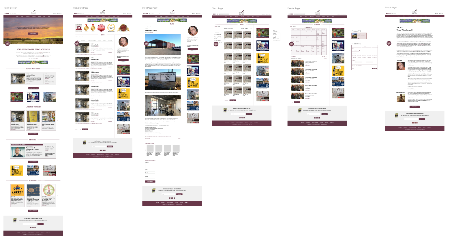
Home Page- The home page would need to house all the information. Instead of cluttering the page with news articles, blogs and advertising content, we broke up the categories on the home page with spacing and lines to clearly show defined areas of content. We also cleaned up the sections by adding a scrolling carousel features that would click left or right to additional articles.
Blog Page- We condensed the amount of categories in the dropdown, and instead of having them listed on a separate page, we created sections on the main blog page showing the different categories available. We also added in the Blog awards on this page, show casing why this platform is important.
Winery / Vineyard Page- Selecting either of these tabs would go directly to the Brilliant Directories URL. Where users would be able to search and plan their trips. They would be able to search for near by lodging and restaurants to complete their itinerary.
Shop Page- We organized the categories so you could see clear defined sections. Just like the Blog page, we condensed the information and decluttered the page so users can navigate and not feel overwhelmed with the information on the shop page.
Events Page- Originally this page was going to be removed from the platform, but our users indicated the events page was one of the main reasons they use Texas Wine Lover’s platform. The events are always up to date so users can see whats happening in different wineries with out being directed away from the website. We displayed the events in a calendar form, where a window would pop up when hovering over an event. We also added in a filter feature if users did no want to use the calendar. The filter would populate search results in a list form as well as update the calendar.
About Page- Most founders hate the About page, no one likes to talk about themselves and what they do. They want their work to speak for it self. But our users indicated they love seeing the about page and the contributing writers that collect this information. They also have wonderful things to say about the founder ( Jeff ) and want him to take the credit for building such an amazing platform.
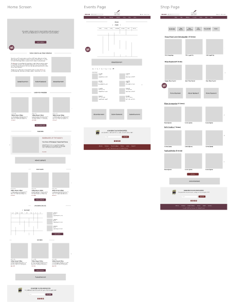
As we started to design we created 3 main wireframes and built the subsequent pages around them. This gave us a baseline to work with before we got into the details.
Initial Wireframes
The Foundation is set, time to connect the dots.
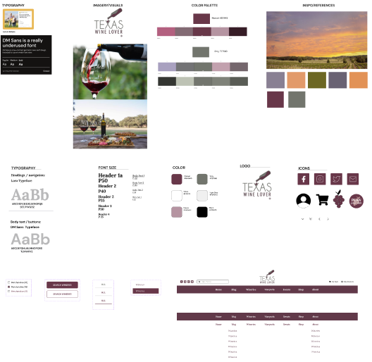
Before we expanded our wireframes into a full prototype, we needed to agree upon the updated branding. The Texas Wine Lover Logo is known and shouldn’t change because of a redesign. The redesign can be created around the logo.
We first found an inspirational image , this image would serve as the “feel” of the website setting a tone for how we want the users to feel when they navigate through the portal. I also tested the two colors in the logo in Adobe Color. From the Maroon, I pulled a Monochromatic color palette, and from the Grey, I pulled split complimentary and Shades of grey. We now had a range of colors that were aesthetically pleasing to the eye and matched back to the logo.
We also include typeface and font sizes, the logo, Icons and components. We put all this information on the same document so that when we build out the remaining wireframes everything is uniform. All the components are the same size, and color.
Time to Create the Prototype.
Though we don’t have a specific user flow and our main objective was to overhaul the aesthetic of the platform, we still need to create a clickable prototype. We added features like “hovering” over the navigation bar, “Pop ups” For filtering, clickable call to action buttons that lead users to specific pages and content.
Clickable Prototype
Step 5: Test
Test, Test , Test
Testing is always a major part of the process, but due to our tight timeline and no user flow we skipped this step and went straight to presenting our findings and solutions to our client. If we had the time and could focus on specific user flows, would conduct several usability tests.
1.) On specific user flow to ensure theres no friction.
2.) Branding and aesthetics, testing to ensure the branding was on the right track for the essence of the website.
What is next:
For our project the next steps are to pass off the final document’s to the client, and answer any last minute questions they have before we end our communication.
If this were a real world scenario, the next steps would be very different.
1.) Usability testing on the prototype.
2.) Work with Developers to implement the changes and test the usability and accessibility of the update.
3.) Prioritize features and future business strategies.
4.) Repeat the research and ideation process for new features and opportunities.
5.) Track each change with a specific set of metrics discussed with the client to ensure we are on the right track and making the improves he needs to continue to run his business.


